Branding
The following are highlight branding projects from my design experience including Jailbird (bar & restaurant), Eyeseeyou (eyewear e-commerce), and Awaken (strength training facility).

Services:
Branding, Color Palette
Identity, Logo, Mascot Design, Product Design, & Mural Graphics Design
Roles:
Art Director, Illustrator, & Brand Manager
Client:
Josh Gonzales - CEO/Founder
Location:
Indianapolis, Indiana, USA
After the successful launch of Thunderbird, a well-known cocktail bar based in Fountain Square, Indianapolis, Indiana, Josh Gonzales, the business owner was ready to take on his second ambitious project. Inspired by the famous local writer Kurt Vonnegut’s book title, as well as setting a restaurant/bar franchise, Josh decided to name his second project Jailbird. Jailbird is a college dive bar tailored towards the students and faculty, as well as the neighborhood around the University of Indianapolis (UofI). The client’s goal is to create a college dive bar that’s hip, energetic, accessible, and always timeless to Indianapolis’s bar and dining community.
Process:
1. Logo Research
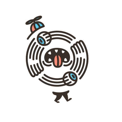
After presenting the client with 3 different mood boards for visual directions, I started to visually explore the possibilities for Jailbird’s logo. I decided to take Jailbird’s name literally and explore as many illustration styles as possible. More than 150 birds were drawn and displayed above. Please keep in mind, only one bird gets to be the face of this business at the end of this journey.


2. Logo Presentation
Out of the 150 birds, this is the lucky bird that was chosen to be the face of the brand
During the presentation, the client and I narrowed the selections from 150 birds down to 25 birds. Typically I try to offer 3-5 design options to my clients, but this was an exception as we struggled to select the top bird out of the flock.

Alternate Type Logo 
Alternate Mascot Logo
Alternate Type Logo3. Brand Development
With the chance to develop the rest of the branding with the attitude of “all gas no break”, the client requested me to pull as many wild cards as possible. Below are some of our favorite eggs.

T-shirt Design

Oh, forgot to mention. The JAILBIRD groovy type was customized by our friend, Chris Corey

Jailbird "Bootleg" merch

Early concept of Jailbird interior mural (A)

Reflection of the interior mural design

Early concept of Jailbird interior mural (B)

Jailbird cup

Interior mural design showing through the window

Interior mural design (See Illustration for case study)

Interior decoration

This screams "brand loyalty"
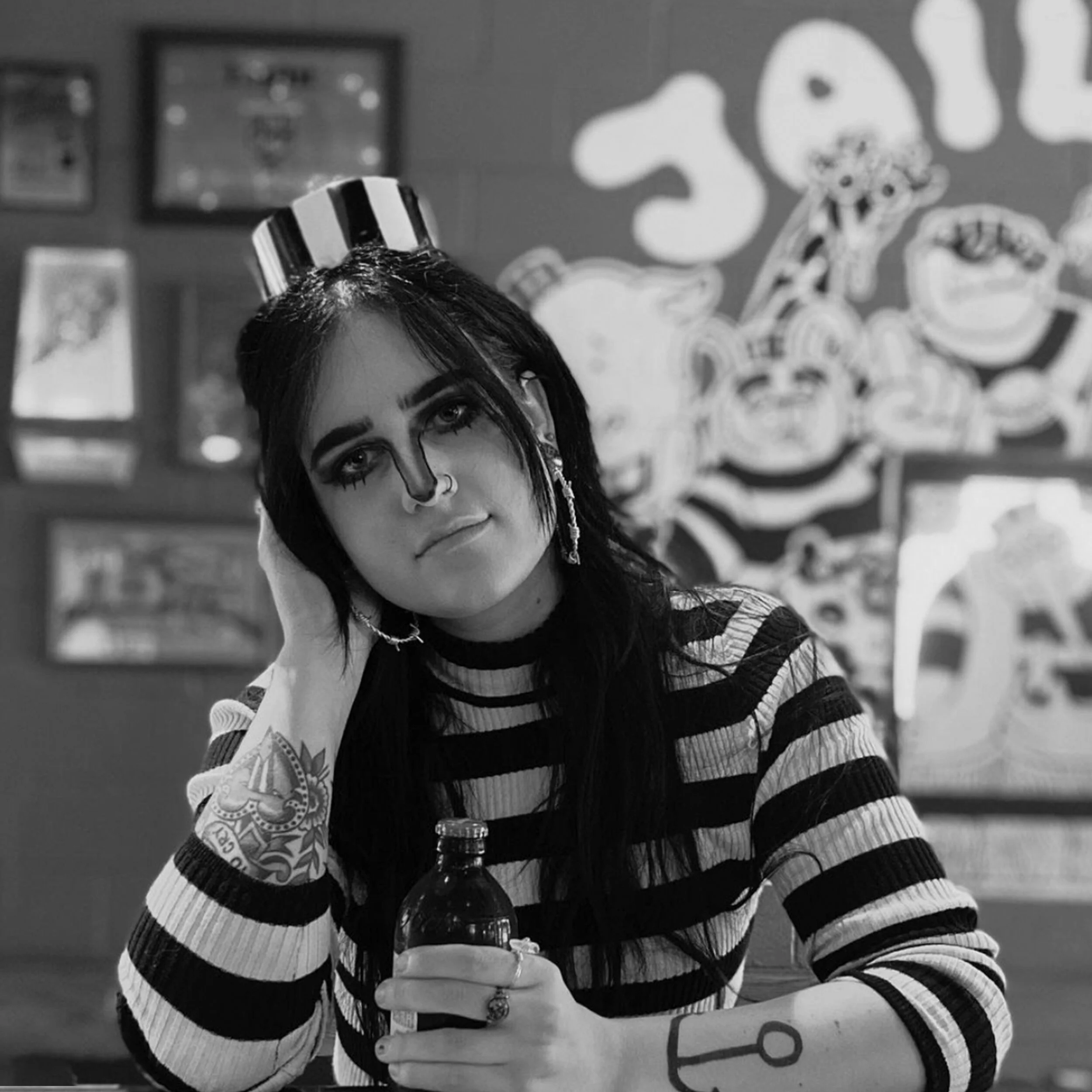
Halloween Contest of 2018

Services:
Branding, Color Palette
Identity, Logo, Marketing Services, Motion Graphics, UI/UX Development
Roles:
Art Director, Illustrator, Motion Graphics Artist, Social Media Manager, Project Manager, and Brand Manager
Client:
Eyeseeyou.vision
Location:
San Diego, California
Eyeseeyou.vision or Eyeseeyou is a San Diego-based e-commerce startup that provides high-quality and lightweight index anti-blue light glasses and sunglasses. The client wanted to provide affordable yet high-quality glasses specifically to lower-middle and middle-class American consumers. Vision healthcare is typically not being prioritized as a means of necessary expense in these communities as most of the glasses in the market are overpriced. Eyeseeyou aimed to position itself as a budget-friendly and approachable brand to welcome its target audience and differentiate itself from the industry’s “serious” or “expensive” stereotypes.
Process:
1. Logo Research
I started the research by looking into other competitions’ branding to understand the “stereotypes” the clients mentioned during the initial meeting. Once I reached a comfortable point in the research, I began constructing visual directions for Eyeseeyou’s branding possibilities. From there, I narrowed my research down to 3 moodboard directions and presented them to my client for selection. After presenting the sketched concepts to my client, he fell in love with the idea of having a mascot for the brand. After the client made his selection from the sketches, the selected sketches were digitized. We started looking into typography and color palette that reflect the brand values well and bring out more personality from the lil glasses character!
2. Logo Presentation
I approached Eyeseeyou’s logo with a round serif type like Frankfurter Standard together with sky blue and carrot orange as the main brand colors. With the color, I managed to add some spirit into the “Lil Glassies” mascot. To establish a fun, approachable, and reliable brand, I went with a thicker stroke as part of the visual elements. After designing and creating brand elements from Eyeseeyou logo, I utilized the eye-catching visual style into the brand assets such as the icon set displayed above. A QR code was also created for ease of access to the website for consumers.
3. Brand Development
Now that I have developed the logo, designed a color palette, created a shape, selected fonts for Eyeseeyou, it was about time to develop the characters and “personality” of the brand through its website, products, packaging, social media presentation, and most importantly, the consumers.


Services:
Branding, Color Palette, Logo, and Marketing Services
Roles:
Designer & Project Manager
Client:
Todd Scheidt - CEO/Founder
Location:
Indianapolis, Indiana, USA
Todd Scheidt, the owner of Awaken Strength Performance Wellness (gym), also as known as, Awaken, started running his personal physical training facility shortly after graduating from Indiana University with his B.S. Kinesiology in Health and Fitness Specialist in Indianapolis, Indiana. He had tried working with multiple other design studios prior to me. However, nobody can fully capture his visions. In this case, I listened to Todd’s goals and visions before plunging into the design; and when I felt ready to capture his visions, I successfully delivered a logo that is exactly what he wanted (which he got a tattoo of eventually). With this win in the books, Todd requested to push the project further and eventually, I helped him develop a brand.
Process:
1. Logo Research
With Awaken, Todd had been using a logo that he bought from a freelance designer from Fiverr when he first started his business after graduation. It was what he could afford at the time, not what he wanted. The client elaborated on the idea of having a pyramid shape logo as he believes bodybuilding is about building a strong base and then eventually you will be able to build your mentality, as described by him, the tip of the pyramid. For the client, he described bodybuilding to me as a puzzle. Everybody’s physique and nutrient intake work differently, so every client of his receive different workout routines and dietary plans. Hence, he wanted to see a puzzle-like pyramid logo to reflect these aesthetics through the logo of his brand.
2. Logo Presentation
After meeting and presenting the concept sketches to Todd, I took his selection from the sketch on paper and digitized them. Below, you can see the comparison between the client’s old logo that he purchased from Fiverr versus the logo design I came up with. The client did not like how bright his original logo was as it did not reflect his personality, so we decided to go with maroon color, which gives the brand a mature and stable look. From his description of wanting to see a logo that looks like a puzzle inside a pyramid, I took his vision and translated it into the new version of Awaken logo.
3. Brand Development
From our initial meeting, the client was very specific about what he wanted from me creatively. Other than the need to rebrand his business, he needed help with merchandise design, window display to attract traffic, and also business cards for him to promote his brand. Upon completion of the logo design, I provided my client with the following designs as part of his brand development.
Awaken T-shirt design
Window display design
Business card design